The publish dates for the new D&D books were released this week. Today, higher resolution versions of the cover art for the core books are making their rounds.
First impressions... Mixed at best.
I couldn't quite put my finger on it, but something about the art was a little unsettling to me. The compositions were a little too frenetic. The Trollsmyth summarized some of the same issues that I had noticed: background and foreground elements don't mesh well; lighting effects are random with some parts hazy or smoky while other parts are stark and crisp; the action doesn't really tell a story but seems to be action for the sake of action only.
While there were no major "I hate this" elements, there also were not any "I love that" parts either. The one exception might be the starter set. The cover is clearly an homage to the Red Box basic set of the past, which I really like, but the framing of the illustration seems wrong. Why is the warrior's arm and legs cut off the edge of the box cover? That illustration could be way more effective if they zoomed back a little more to show the warrior's full body.
The Player's Handbook suffers the same issue. The two characters are cut off by the edges of cover. Zoom out and re-position a little and you can show both characters in the fight of their life. For the Monster Manual, I like the iconic monster front and center, but the rest of the piece is a mishmash of misplaced elements. The DM Guide has an odd perspective angle that appears askew. Elements are leaning forward in the foreground and leaning backward in the background.
On the other hand, the artwork does seem to convey action and excitement. You want the art direction to shout "EPIC ADVENTURE AWAITS INSIDE!" while sitting on the store shelves. In a post on Google+, I note that cover art needs to me like a movie trailer. It's all quick cuts, explosions and gun fights even if the movie only contains about 10% of that. Since the target audience needs to include young, new gamers, the illustrations need to convey action and excitement.
The goal of communicating excitement may have been achieved, but it seems a shame that this artwork reaches for awesome, but seems to fall short in its execution.
EDIT 05/21: After looking at this art for a little while longer, I wanted to add more detail to my issues.
In looking at the covers, they are not terrible, but they have more of a "early draft" feel rather than a final revision. With some additional feedback and revision, I think I would have liked them much better.
Player's Handbook
The artwork isn't too bad for this book, but it is poorly framed. Looking at the cover cropping versus the full size art, it is apparent the framing is sloppy. The barbarian's warhammer (staff?) is cut off the edge of the page. The second adventurer in the foreground is also cut off. This art could be vastly improved if the cover were zoomed back slightly to include the detail of both PCs.

Also, because the colors are muted, the action is confusing as the adventurer and giant blend together. With the addition of the "spell glow" hand, your eyes focus on the part of the image which has the most blurry and frenetic action. It's difficult to separate the detail of the PC from the detail of the giant. Better contrast or different lighting between the figures in the scene would have made the details more visible and the action less confusing.
I actually like the subject and composition of the art, for the most part, but it is hurt by the crop and focus issues I named.
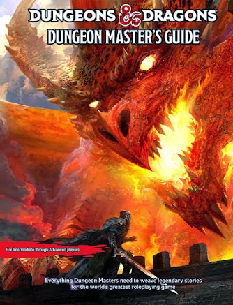
Dungeon Master's Guide

From a composition perspective, I was thrown off from the beginning. Foreground elements appear to be leaning to toward the viewer and background elements are leaning away. While this may have been on purpose, I think it makes the composition look as if it was an early draft. Part of the issue here again is the crop. The full size artwork suffers less from this issue because the lean forward / lean back elements aren't as emphasized when you see the full size image.
Full size PHB and DMG art: http://tylerjacobson.blogspot.com/2014/05/d-core-books.html
 Monster Manual
I like that an iconic was used front and center, but as others have noted, we've seen this same type of art before and the new composition is not really an improvement. Take a look at the Wayne Reynolds beholder below. Very similar composition. While I like the beholder itself in the new image better, all the other elements in the illustration feel tacked on as if there were several disparate elements pasted together to make a whole. As a composition, the Reynolds art works better as a whole even if his beholder is a little goofy looking.
 Trollsmyth already picked this cover apart pretty well, so I don't have much more to add. I have most of the same issues. However, based on the poor cropping of the other two books, I'm wondering if the larger version of the Monster Manual art would also make more sense if we saw the whole image.
Starter Set

In Conclusion
As I mentioned before, the artwork isn't actually so horrible, but its execution leaves something to be desired. A few tweaks here and there and these covers could have been awesome. Instead, they are "meh".
Stuart Robinson posted a mock up to Google+ (shown below) using existing D&D artwork that blows all of these out of the water. His changes also make improvements to the branding IMO (love the altered logo treatment). I hope Wizards of the Coast is listening. If only they could quickly make some changes to the layout and composition, but based on the timelines, that is highly unlikely.
 |
| Improvements brought to you by Stuart Robinson |


No comments:
Post a Comment